springboot 수업일지
17일차 frontend-html(2)
wannabe
2021. 7. 13. 17:20
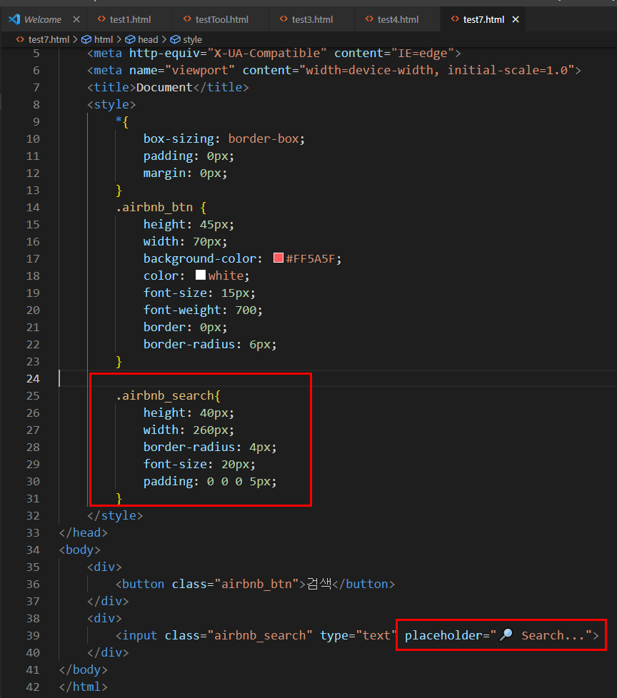
padding: 0 0 0 5px; 북/동/남/서 값을 넣으면 된다.
이런 요소들 하나하나를 컴포넌트라고 한다.
▶
https://blog.naver.com/getinthere/221576015779
HTML/CSS 에어비엔비 만들기 - 14 airbnb 완성 버전2
완성 파일
blog.naver.com
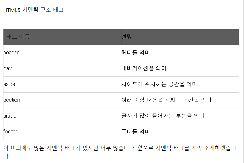
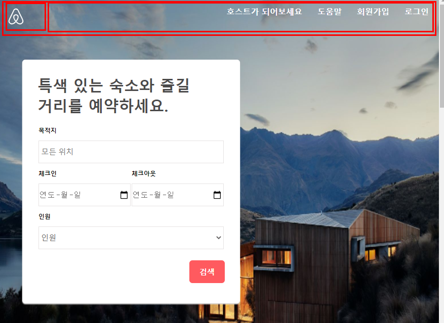
시멘틱태그 사용
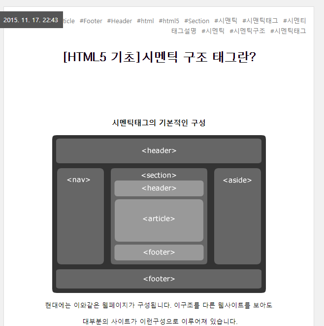
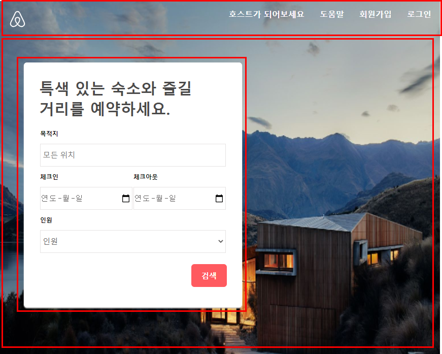
위 그림에 대한 구조는??
그리고
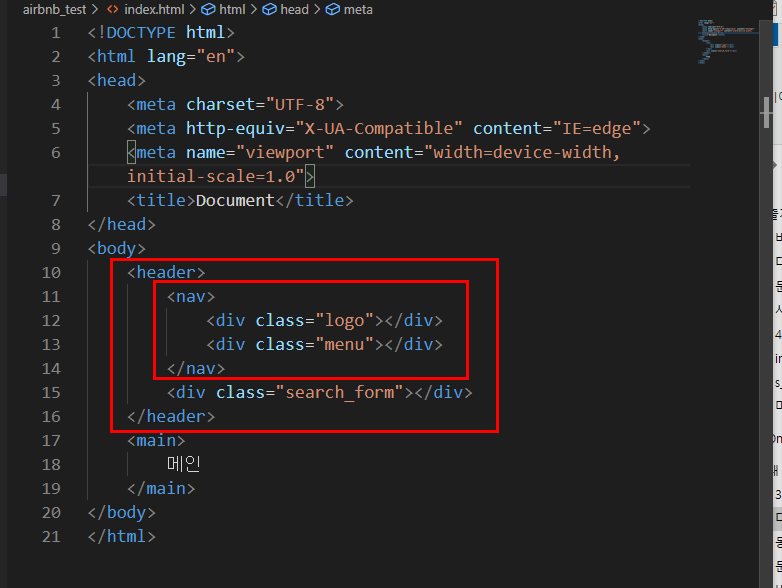
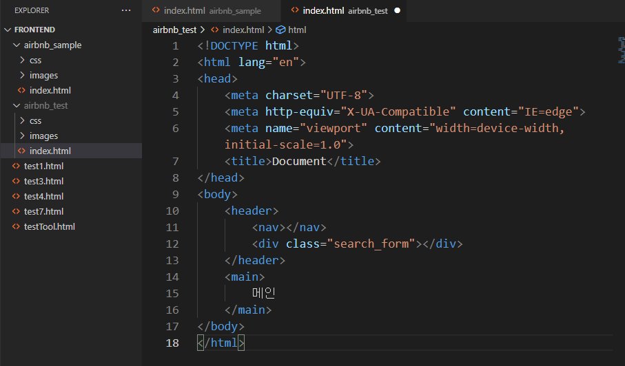
다음으로 search_form
다시 구조를 다음과 같이 설정하자
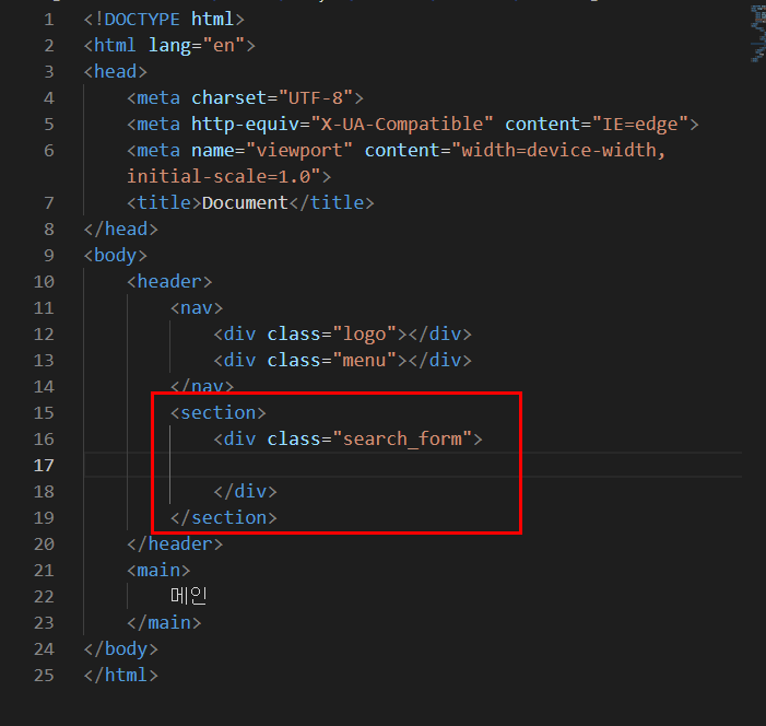
그리고 search_form구조
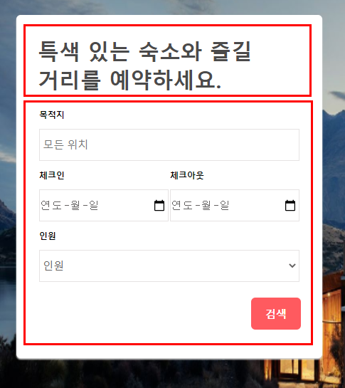
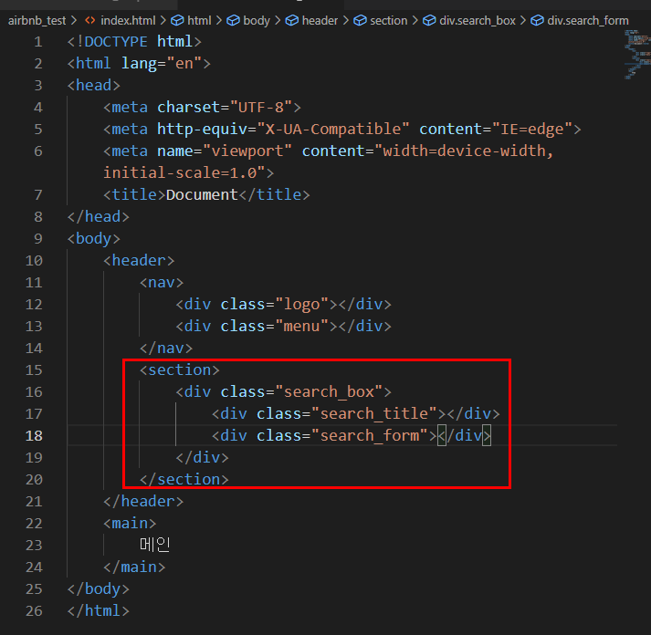
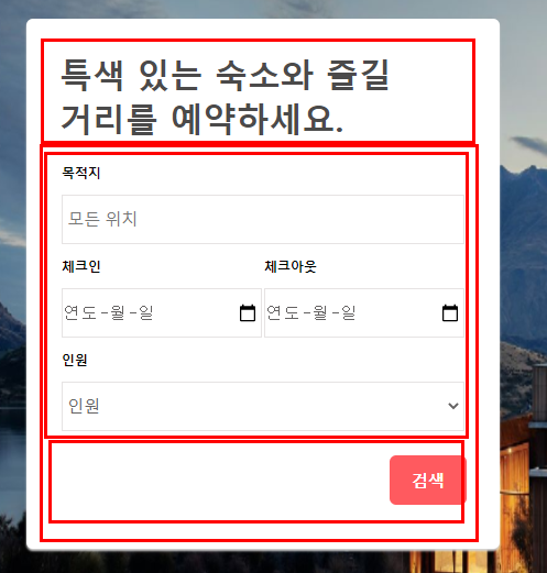
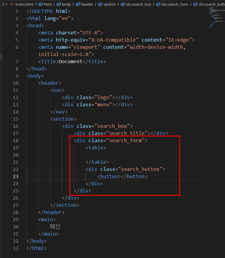
search_form안에 구조는 table로 하자/ 검색 버튼도 박스 안에 넣자
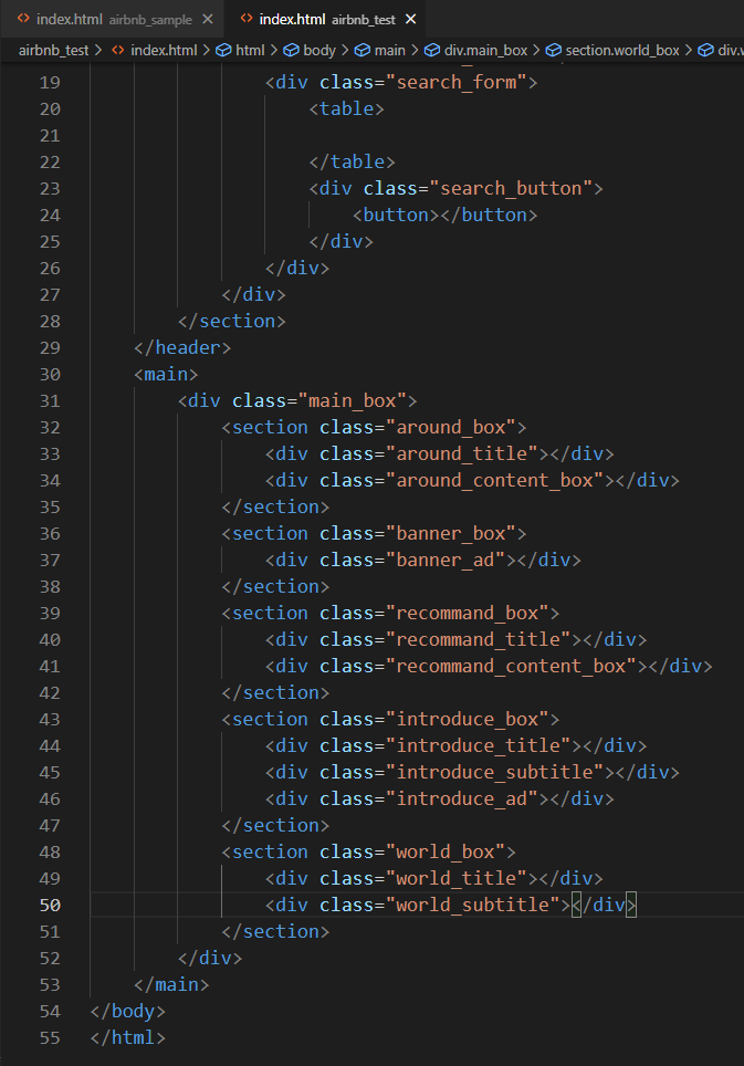
다음에 main
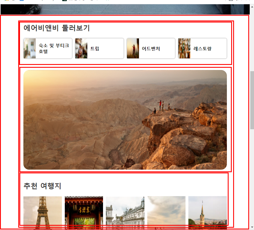
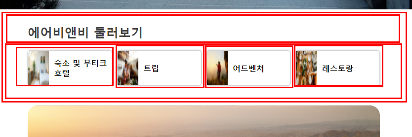
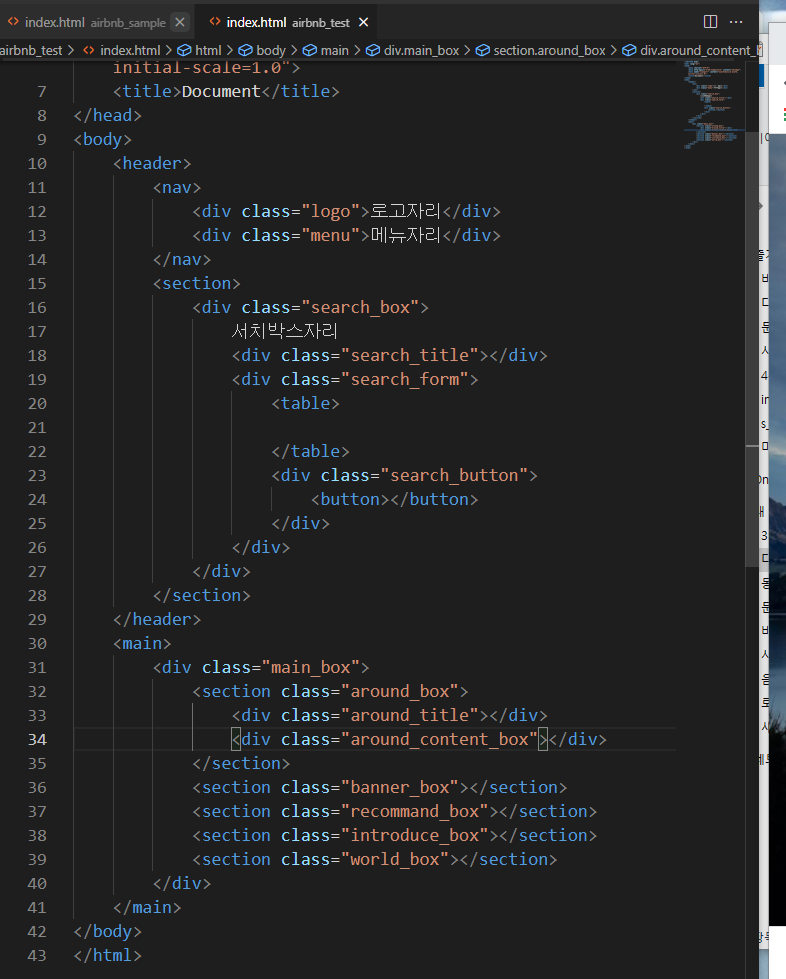
구조완성!!!
css디자인
SASS개념!!!!!!!!!!!!!! 코드 구조화 보기 쉽게 해준다
CSS 이름 규칙 스타일 => BEM 명명 규칙
https://naradesign.github.io/bem-by-example.html
예제로 이해하는 BEM.
HTML, CSS(flex/grid), UI/UX, Accessibility
naradesign.github.io
<중간 코드>
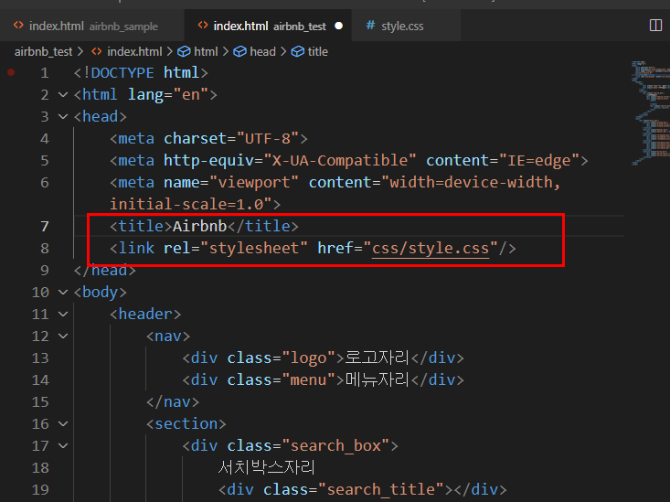
index.html 코드
<!DOCTYPE html>
<html lang="en">
<head>
    <meta charset="UTF-8">
    <meta http-equiv="X-UA-Compatible" content="IE=edge">
    <meta name="viewport" content="width=device-width, initial-scale=1.0">
    <title>Airbnb</title>
    <link rel="stylesheet" href="css/style.css"/>
</head>
<body>
    <header>
        <nav>
            <div class="logo">
                <svg viewBox="0 0 1000 1000" role="presentation" aria-hidden="true" focusable="false"
                    style="height: 1em; width: 1em; display: inline-block; fill: currentcolor;">
                    <path
                        d="m499.3 736.7c-51-64-81-120.1-91-168.1-10-39-6-70 11-93 18-27 45-40 80-40s62 13 80 40c17 23 21 54 11 93-11 49-41 105-91 168.1zm362.2 43c-7 47-39 86-83 105-85 37-169.1-22-241.1-102 119.1-149.1 141.1-265.1 90-340.2-30-43-73-64-128.1-64-111 0-172.1 94-148.1 203.1 14 59 51 126.1 110 201.1-37 41-72 70-103 88-24 13-47 21-69 23-101 15-180.1-83-144.1-184.1 5-13 15-37 32-74l1-2c55-120.1 122.1-256.1 199.1-407.2l2-5 22-42c17-31 24-45 51-62 13-8 29-12 47-12 36 0 64 21 76 38 6 9 13 21 22 36l21 41 3 6c77 151.1 144.1 287.1 199.1 407.2l1 1 20 46 12 29c9.2 23.1 11.2 46.1 8.2 70.1zm46-90.1c-7-22-19-48-34-79v-1c-71-151.1-137.1-287.1-200.1-409.2l-4-6c-45-92-77-147.1-170.1-147.1-92 0-131.1 64-171.1 147.1l-3 6c-63 122.1-129.1 258.1-200.1 409.2v2l-21 46c-8 19-12 29-13 32-51 140.1 54 263.1 181.1 263.1 1 0 5 0 10-1h14c66-8 134.1-50 203.1-125.1 69 75 137.1 117.1 203.1 125.1h14c5 1 9 1 10 1 127.1.1 232.1-123 181.1-263.1z">
                    </path>
                </svg>
            </div>
            <div class="menu">
                <div><a href="#">호스트가 되어보세요</a></div>
                <div><a href="#">회원가입</a></div>
                <div><a href="#">로그인</a></div>
                <div><a href="#">도움말</a></div>
            </div>
        </nav>
        <section>
            <div class="search_box">
                서치박스자리
                <div class="search_title"></div>
                <div class="search_form">
                    <table>

                    </table>
                    <div class="search_button">
                        <button></button>
                    </div>
                </div>
            </div>
        </section>
    </header>
    <main>
        <div class="main_box">
            <section class="around_box">
                <div class="around_title"></div>
                <div class="around_content_box"></div>
            </section>
            <section class="banner_box">
                <div class="banner_ad"></div>
            </section>
            <section class="recommand_box">
                <div class="recommand_title"></div>
                <div class="recommand_content_box"></div>
            </section>
            <section class="introduce_box">
                <div class="introduce_title"></div>
                <div class="introduce_subtitle"></div>
                <div class="introduce_ad"></div>
            </section>
            <section class="world_box">
                <div class="world_title"></div>
                <div class="world_subtitle"></div>
            </section>
        </div>
    </main>
</body>
</html>
CSS코드
* {
padding: 0px;
margin: 0px;
box-sizing: border-box;
}
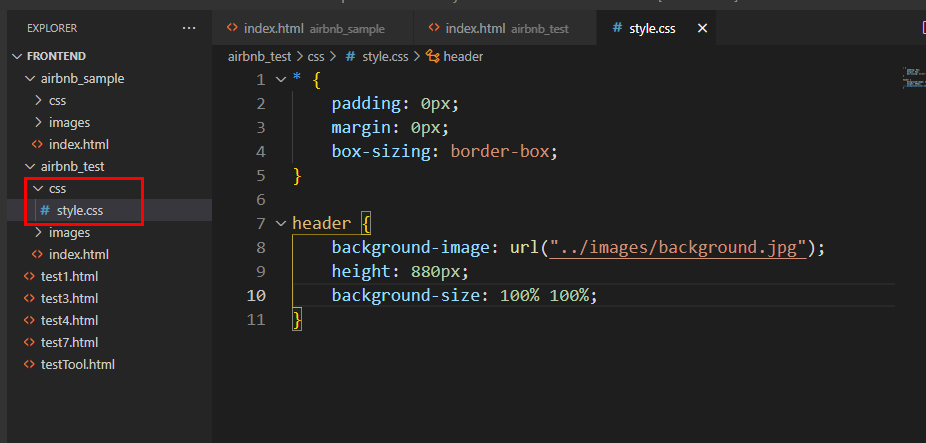
header {
background-image: url("../images/background.jpg");
height: 880px;
background-size: 100% 100%;
}
/* 네비게이션 디자인 시작----------------------- */
nav {
display: flex;
justify-content: space-between;
padding: 20px;
}
/* 로고 디자인 시작 */
.logo {
color: white;
font-size: 30px;
font-weight: 800;
}
/* 메뉴 디자인 시작 */
.menu {
display: flex;
align-items: center;
}
.menu div{
margin-left: 15px;
}
.menu a{
text-decoration: none;
color: white;
font-weight: 800;
}
.menu a:hover{
color: rgb(216, 247, 247);
}
/* 메뉴 디자인 끝 */
/* 네비게이션 디자인 끝----------------------- */
.search_box {
width: 430px;
background-color: white;
display: inline-block;
padding: 20px;
position: relative;
top: 10px;
left: 50px;
border-radius: 6px;
box-shadow: 0px 4px 4px 0px gray;
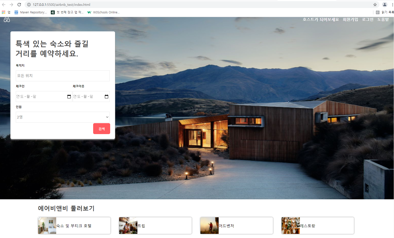
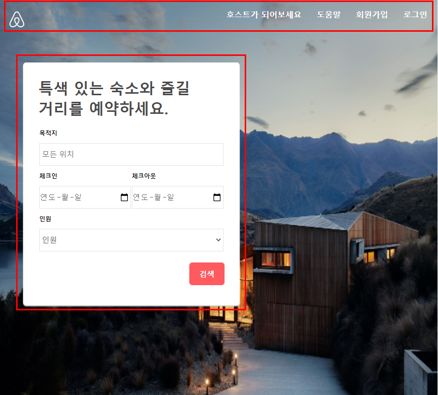
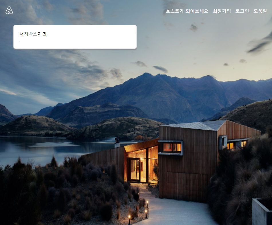
}위에 코드로 디자인한 결과는???
primary color
secondary color 용어!!
실습한 최종 코드
<!DOCTYPE html>
<html lang="en">
<head>
    <meta charset="UTF-8">
    <meta http-equiv="X-UA-Compatible" content="IE=edge">
    <meta name="viewport" content="width=device-width, initial-scale=1.0">
    <title>Airbnb</title>
    <link rel="stylesheet" href="css/style.css"/>
</head>
<body>
    <header>
        <nav>
            <div class="logo">
                <svg viewBox="0 0 1000 1000" role="presentation" aria-hidden="true" focusable="false"
                    style="height: 1em; width: 1em; display: inline-block; fill: currentcolor;">
                    <path
                        d="m499.3 736.7c-51-64-81-120.1-91-168.1-10-39-6-70 11-93 18-27 45-40 80-40s62 13 80 40c17 23 21 54 11 93-11 49-41 105-91 168.1zm362.2 43c-7 47-39 86-83 105-85 37-169.1-22-241.1-102 119.1-149.1 141.1-265.1 90-340.2-30-43-73-64-128.1-64-111 0-172.1 94-148.1 203.1 14 59 51 126.1 110 201.1-37 41-72 70-103 88-24 13-47 21-69 23-101 15-180.1-83-144.1-184.1 5-13 15-37 32-74l1-2c55-120.1 122.1-256.1 199.1-407.2l2-5 22-42c17-31 24-45 51-62 13-8 29-12 47-12 36 0 64 21 76 38 6 9 13 21 22 36l21 41 3 6c77 151.1 144.1 287.1 199.1 407.2l1 1 20 46 12 29c9.2 23.1 11.2 46.1 8.2 70.1zm46-90.1c-7-22-19-48-34-79v-1c-71-151.1-137.1-287.1-200.1-409.2l-4-6c-45-92-77-147.1-170.1-147.1-92 0-131.1 64-171.1 147.1l-3 6c-63 122.1-129.1 258.1-200.1 409.2v2l-21 46c-8 19-12 29-13 32-51 140.1 54 263.1 181.1 263.1 1 0 5 0 10-1h14c66-8 134.1-50 203.1-125.1 69 75 137.1 117.1 203.1 125.1h14c5 1 9 1 10 1 127.1.1 232.1-123 181.1-263.1z">
                    </path>
                </svg>
            </div>
            <div class="menu">
                <div><a href="#">호스트가 되어보세요</a></div>
                <div><a href="#">회원가입</a></div>
                <div><a href="#">로그인</a></div>
                <div><a href="#">도움말</a></div>
            </div>
        </nav>
        <section>
            <div class="search_box">
                <div class="search_title">특색 있는 숙소와 즐길<br /> 거리를 예약하세요.
                </div>
                <div class="search_form">
                    <table class="search_form_table" >
                        <tr>
                            <td class="search_form_title" colspan="2">목적지</td>
                        </tr>
                        <tr>
                            <td colspan="2"><input class="search_form_input" type="text" placeholder=" 모든 위치"/></td>
                        </tr>
                        <tr>
                            <td class="search_form_title">체크인</td>
                            <td class="search_form_title">체크아웃</td>
                        </tr>
                        <tr>
                            <td><input class="search_form_input" type="date"/></td>
                            <td><input class="search_form_input" type="date"/></td>
                        </tr>
                        <tr>
                            <td class="search_form_title" colspan="2">인원</td>
                        </tr>
                        <tr>
                            <td colspan="2">
                                <select class="search_form_input" >
                                    <option>2명</option>
                                    <option>3명</option>
                                </select>
                            </td>
                        </tr>
                    </table>
                    <div class="search_button">
                        <button>검색</button>
                    </div>
                </div>
            </div>
        </section>
    </header>
    <main>
        <div class="main_box">
            <section class="around_box">
                <div class="around_title">
                    에어비앤비 둘러보기
                </div>
                <div class="around_content_box">
                    <div class="around_content">
                        <div class="around_content_img">
                            <img src="images/card1.jpg"/>
                        </div>
                        <div class="around_content_text">
                            숙소 및 부티크 호텔
                        </div>
                    </div>
                    <div class="around_content">
                        <div class="around_content_img">
                            <img src="images/card2.jpg"/>
                        </div>
                        <div class="around_content_text">
                            트립
                        </div>
                    </div>
                    <div class="around_content">
                        <div class="around_content_img">
                            <img src="images/card3.jpg"/>
                        </div>
                        <div class="around_content_text">
                            어드벤처
                        </div>
                    </div>
                    <div class="around_content">
                        <div class="around_content_img">
                            <img src="images/card4.jpg"/>
                        </div>
                        <div class="around_content_text">
                            레스토랑
                        </div>
                    </div>
                </div>
            </section>
            <section class="banner_box">
                <div class="banner_ad"></div>
            </section>
            <section class="recommand_box">
                <div class="recommand_title"></div>
                <div class="recommand_content_box"></div>
            </section>
            <section class="introduce_box">
                <div class="introduce_title"></div>
                <div class="introduce_subtitle"></div>
                <div class="introduce_ad"></div>
            </section>
            <section class="world_box">
                <div class="world_title"></div>
                <div class="world_content"></div>
            </section>
        </div>
    </main>
</body>
</html>
* {
padding: 0px;
margin: 0px;
box-sizing: border-box;
}
main section {
margin: 20px 0px;
}
header {
background-image: url("../images/background.jpg");
height: 880px;
background-size: 100% 100%;
}
/* 네비게이션 디자인 시작----------------------- */
nav {
display: flex;
justify-content: space-between;
padding: 20px;
}
/* 로고 디자인 시작 */
.logo {
color: white;
font-size: 30px;
font-weight: 800;
}
/* 메뉴 디자인 시작 */
.menu {
display: flex;
align-items: center;
}
.menu div{
margin-left: 15px;
}
.menu a{
text-decoration: none;
color: white;
font-weight: 800;
}
.menu a:hover{
color: rgb(216, 247, 247);
}
/* 메뉴 디자인 끝 */
/* 네비게이션 디자인 끝----------------------- */
.search_box {
width: 430px;
background-color: white;
display: inline-block;
padding: 20px;
position: relative;
top: 10px;
left: 50px;
border-radius: 6px;
box-shadow: 0px 4px 4px 0px gray;
}
.search_title{
padding: 10px 0px;
font-size: 30px;
font-weight: 800;
color: rgb(75, 75, 75);
}
.search_form_table td{
width: 100%;
}
.search_form_title{
padding: 10px 0px;
font-size: 12px;
font-weight: 600;
}
.search_form_input{
height: 45px;
width: 100%;
color: gray;
font-size: 15px;
border: 1px solid rgb(230,230, 230);
}
.search_button{
display: flex;
justify-content: flex-end;
}
.search_button button{
background-color: #FF5A5F;
color: white;
width: 70px;
height: 45px;
border-radius: 6px;
border: 0px;
font-weight: 700;
cursor: pointer;
}
.search_button button:hover{
background-color: #F3282F;
}
main {
display: flex;
justify-content: center;
}
.main_box {
width: 80%;
}
.around_title {
font-size: 25px;
font-weight: 800;
color: rgb(75, 75, 75);
margin: 20px 0px;
}
.around_content_box {
display: flex;
justify-content: space-between;
}
.around_content{
display: flex;
height: 70px;
width: 23%;
border: 1px solid rgb(210, 210, 210);
border-radius: 6px;
box-shadow: 0px 0px 3px 0px rgb(170, 170, 170);
}
.around_content_img{
flex:1;
}
.around_content_text{
flex:3;
display: flex;
align-items: center;
}
.around_content_img img{
width: 100%;
height: 100%;
}