vscode


html은??? 문서 만드는게 목표!!!!
word에 글을 적고 저장하면? 파일명에 확장자가 .docx로 붙는다. 워드라는 프로그램에서 읽을수 있는 파일이 된다.
css는 문서를 디자인하는 목적
html 문서 만드는게 목적
자바스크립트는 그 문서를 동적으로 반응하도록 하게하는 목적
디자인할 때, 마크업 랭귀지!! 열고 닫는 태그가 있다.
1)열고 닫는 태그가 뭐가 있지???
2)이 태그가 block(문서 끝까지 차지)인지 inline(자기 크기만큼만 차지)인지 알면 된다!!

지울거 지우고 다음과 같이 간략히
body부분에서 반응형으로 만들면 된다!
이 문서에 대한 해석을 브라우저가 한다.
참고로, 자바가 내장에서 가지고 있는 객체가 JRE이다. 즉 기본적으로 들고있는 라이브러리! 기본으로 준다. 왜? 많이 쓰니까
즉, 자바스크립트에서 공부해야할 것은???기본 문법과 내장객체를 알아야한다!!!!!!!!
그래야 body 를 동적으로 반응하게 할 수 있다
그렇다면 css는??? 디자인하는거 공부해야한다. 근데 다 할 수는 없으니 부트스트랩 활용!


<div></div>는?? 빈박스이다.
div는 속성이 기본block이다. inline으로 바꿀수 있다. 작은 박스


이런 작은 박스들이 div태그를 inline요소로 바꾼거다.


너비와 높이는 값이 아닌, 퍼센트로 잡아야 어느 기기에서든 원하는 비율로 나오게 할 수 있다.


inline으로 바꾸면??? 높이가 먹히지 않음


그렇다면, block으로 바꾸고 너비 높이를 300px로 하면?
보이는건 각각 300px만큼이지만 실제로 공간을 끝까지 차지하고 있음


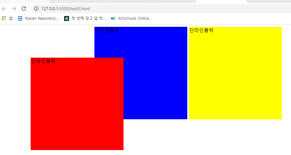
▶다음과 같이 내가 원하는 크기만큼 감싸게 하고 그 공간만 차지하게 하고 싶다면??? inline-block


<inline-block 실습>


기본속성이 옆으로 흘러간다
즉, position에서 relative속성

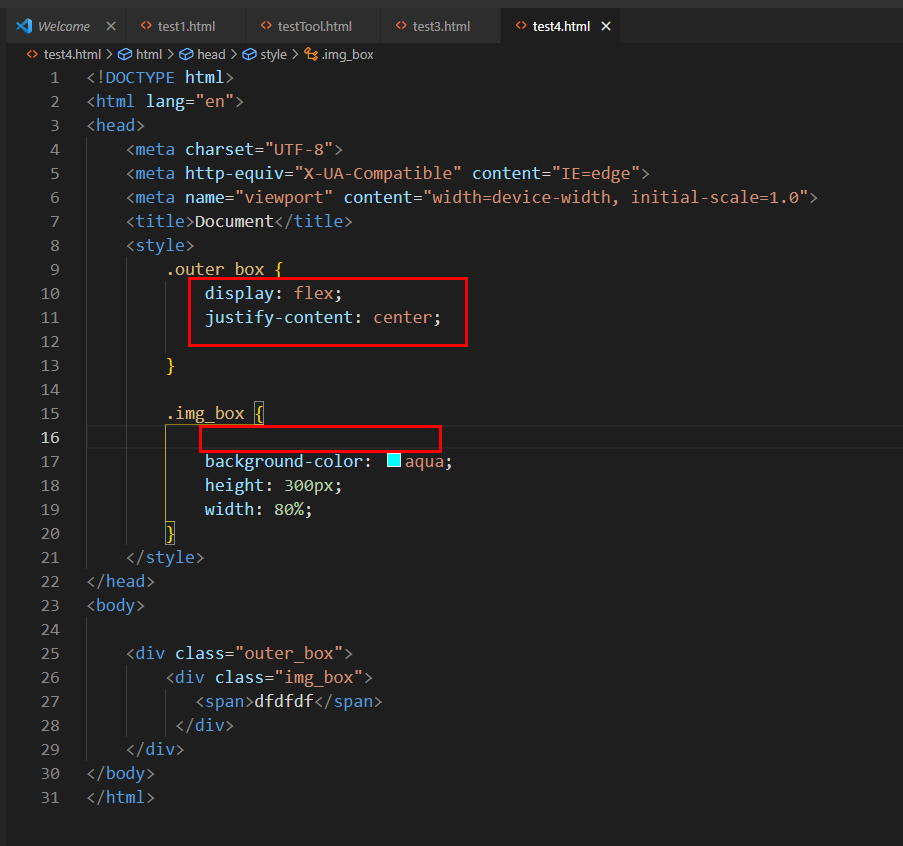
전체를 outer_box가 잡고 있고 내부에 정렬이 center로 설정되어있음
img_box(그림에서 하늘색 박스임) 속성을 inline-block으로 바꾸면 center정렬이 적용된다. (text기본속성은 inline)
자식을 내부적으로 인라인으로 바꿔서 배치한것


text-align 은 가로정렬할때!!!(전체적인 부분에서)
그외에는???? 내부 정렬할때, flex사용!!
<span>은 div랑 똑같은데 기본속성이 inline~!


*CSS Flexbox Layout
*Grid Layout
먼저 flexbox해보자


center 배치가 안먹힘
flex로 하면??? (안드로이드에서 layout weight속성이랑 같음)
자식을 내부적으로 인라인으로 바꿔서 배치한것과 같은 개념

속성이 block인데도...인라인 블락처럼 됨(flex에서는 이런게 다 무너짐)
이제 글자를 가운데 정렬하자!!!!!
부모가 자식의 위치에 제약을 준다!!!
justify-content: center; //가로 정렬 (수직정렬, main axias)
align-items: center; //세로 정렬(수평정렬 cross axias)


flex의 자식은??? 항상 inline-block이다!!!!!!


inline-block이니까 높이가 꽉채워진다!


▶그 다음으로 다음과 같은 배치를 해보자

<!DOCTYPE html>
<html lang="en">
<head>
    <meta charset="UTF-8">
    <meta http-equiv="X-UA-Compatible" content="IE=edge">
    <meta name="viewport" content="width=device-width, initial-scale=1.0">
    <title>Document</title>
    <style>
        .outer_box {
            display: flex;
            justify-content: center;

        }

        .img_box {
            display: flex;
            background-color: aqua;
            height: 300px;
            width: 80%;

        }

        .box1 {
            flex: 1;

            background-color: rgb(245, 72, 72);
            align-items: center;
        }
        .innerbox1 {
            height: 50%;
            display: flex;
            background-color: sandybrown;
            justify-content: center;
        }
        .innerbox2 {
            height: 50%;
            display: flex;
            background-color: seagreen;
            align-items: flex-end;
        }
        .box2 {
            flex: 1;
            display: flex;
            background-color: blue;
            justify-content: flex-end;
            align-items: center;
        }
    </style>
</head>
<body>

    <div class="outer_box">
        <div class="img_box">
            <div class="box1">
                <div class="innerbox1">
                    <span>inner1</span>
                </div>
                <div class="innerbox2">
                    <span>inner2</span>
                </div>
            </div>
            <div class="box2">
                <span>두번째글자</span>
            </div>
         </div>
    </div>
</body>
</html>
위 코드와 달리 강사님 코드!!!

flex-direction: column; 이 속성을 사용함!!!(기본 디폴트는 row로 설정되어있었음)
<!DOCTYPE html>
<html lang="en">
<head>
    <meta charset="UTF-8">
    <meta http-equiv="X-UA-Compatible" content="IE=edge">
    <meta name="viewport" content="width=device-width, initial-scale=1.0">
    <title>Document</title>
    <style>
        .outer_box {
            display: flex;
            justify-content: center;

        }

        .img_box {
            display: flex;
            background-color: aqua;
            height: 300px;
            width: 80%;

        }

        .box1 {
            flex: 1;
            display: flex;
            flex-direction: column;
            background-color: rgb(245, 72, 72);
            align-items: center;
        }
        .innerbox1 {
            flex : 1;
            width: 100%;
            display: flex;
            background-color: sandybrown;
            justify-content: center;
        }
        .innerbox2 {
            flex: 1;
            width: 100%;
            display: flex;
            background-color: seagreen;
            align-items: flex-end;
        }
        .box2 {
            flex: 1;
            display: flex;
            background-color: blue;
            justify-content: flex-end;
            align-items: center;
        }
    </style>
</head>
<body>

    <div class="outer_box">
        <div class="img_box">
            <div class="box1">
                <div class="innerbox1">
                    <span>inner1</span>
                </div>
                <div class="innerbox2">
                    <span>inner2</span>
                </div>
            </div>
            <div class="box2">
                <span>두번째글자</span>
            </div>
         </div>
    </div>
</body>
</html>
https://blog.naver.com/getinthere/222428827614
HTML Flex 연습
getinthere님의블로그
blog.naver.com
▶ <iframe>태그 등..
https://blog.naver.com/getinthere/222428864949
HTML 태그 기본
getinthere님의블로그
blog.naver.com
position 속성 중에 absolute속성! 글자를 absolute로! 그림은 static속성으로 해서 글자와 그림을 붙일수 있다.
<<공부하기>>
display : flex;
flex-wrap속성!!!!!!!!!!!!!!
display : grid;
grid-template-columns: auto auto auto;
grid-gap: 3px;

<!DOCTYPE html>
<html lang="en">
<head>
    <meta charset="UTF-8">
    <meta http-equiv="X-UA-Compatible" content="IE=edge">
    <meta name="viewport" content="width=device-width, initial-scale=1.0">
    <title>Document</title>
    <style>
        *{
            box-sizing: border-box;
            padding: 0px;
            margin: 0px;
        }
        .airbnb_btn {
            height: 45px;
            width: 70px;
            background-color: #FF5A5F;
            color: white;
            font-size: 15px;
            font-weight: 700;
            border: 0px;
            border-radius: 6px;
        }
    </style>
</head>
<body>
    <div>
        <button class="airbnb_btn">검색</button>
    </div>
    <div>
        <input class="airbnb_search" type="text">
    </div>
</body>
</html>'springboot 수업일지' 카테고리의 다른 글
| 17일차 frontend-html(2) (0) | 2021.07.13 |
|---|---|
| 디자인 참고 (0) | 2021.07.12 |
| 15일차 글쓰기save (0) | 2021.07.09 |
| 14일차 게시글상세보기/글쓰기페이지 (0) | 2021.07.08 |
| 13일차 회원정보변경/글목록페이지 (0) | 2021.07.07 |


